
Problem
A fragmented experience that made users drop off
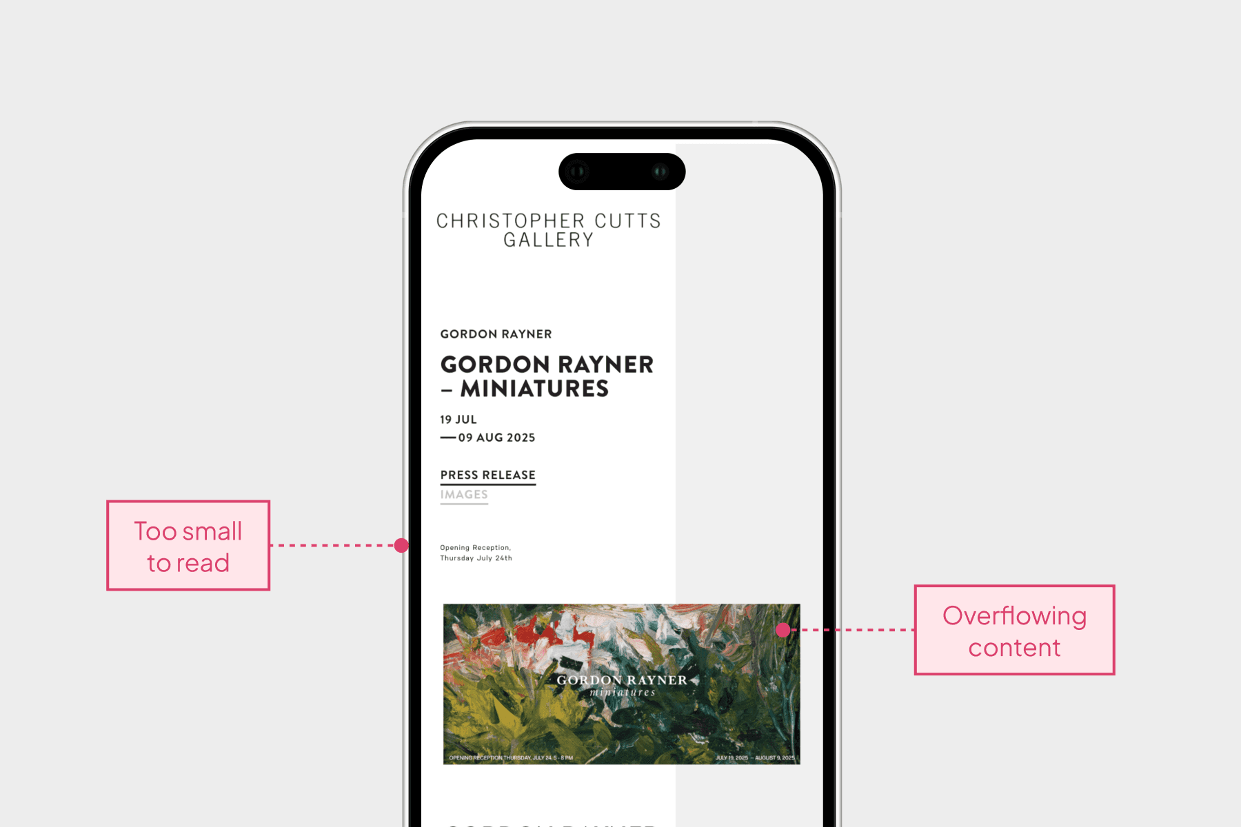
The gallery offered thousands of artworks, but a fragmented shopping journey and poor mobile experience prevented users from reaching a booking. I conducted a site audit to analyze the end-to-end user journey and uncovered three core problems.

Solutions
Connecting art discovery directly to booking
AI reads through a job description and extracts the relevant details, so adding a new application takes seconds. This directly addressed the most repetitive part of the tracking process.
Find the right artwork faster with filters
With thousands of artworks available, it's crucial to help customers find what they’re looking for efficiently. The filter allows customers to refine artworks by various categories, such as artist, date, medium, and size, streamlining the discovery process.
Book an appointment instantly from the artwork page
By allowing customers to book appointments online directly on the artwork page, I streamlined the shopping experience by removing friction such as making phone calls or sending emails to arrange their gallery visit.
Shop on any device freely
I created a responsive website design that adapts to different screen sizes. This ensures customers can easily browse and shop for artwork on their phones without needing to zoom or deal with layout issues.
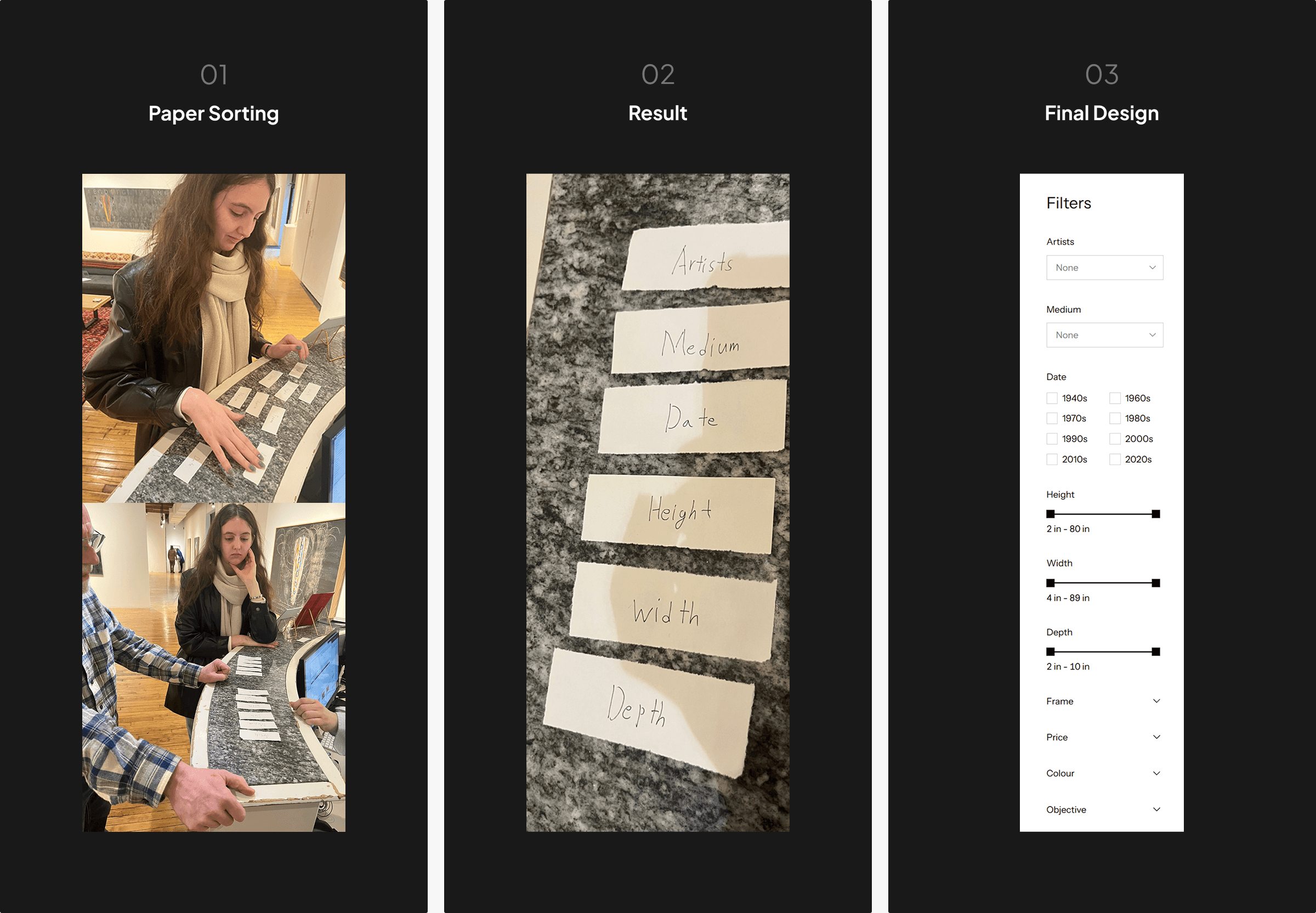
When filters became too many…
After discussion, we landed on ten filters, but displaying all of them at once made the interface too lengthy. I conducted a card sorting with the team to organize and prioritize the filters.
Based on the result, I categorized the filters into two groups
Primary filters: The six most important options were displayed in an expanded state
Secondary filters: The remaining options were tucked into a dropdown to reduce visual clutter
This structure makes using the filters more approachable and less overwhelming, allowing users to explore filters in smaller, manageable chunks.
Development
Built, reviewed, and revised
After building the website, I worked with the gallery team in review sessions using the real artwork collection to test usability. Through this process, I refined the design to ensure the site could present artworks across all price ranges and categories.
Outcome
Increased customer engagement
Appointment bookings increased by 20% within the first 3 months of redesigning the artwork shopping flow and adding online booking. Mobile return visit rate also rose by 30% following improvements to the mobile experience.

Takeaway
The value of prototyping
I learned that prototyping is a faster way to communicate design revisions. During the project, I revised the design directly on the live front end since I was also developing the website. However, even small visual changes took more time than expected because each revision required implementation, review, and further adjustments.
Through this experience, I realized that creating and reviewing a prototype first would have been more efficient. Validating design decisions in a prototype before development can reduce iteration time.


